

Stretched Painting
2 November 2016
By Tori Maas
Stretched Painting brought together the work of four female artists, all of whom are interested in referencing the conventional notions of painting while pushing their work into three-dimensions. Fields of texture, lavish colour and art historical references were transformed onto multiple planes for the viewer to traverse. Situated at the Ontario College of Art & Design University Student Gallery from September 8th until October 1st 2016, the show also marked the beginning of the 2016/2017 academic year at OCAD University. The exhibition was curated by Toronto-based artist Emily Harrison, and featured the work of Wallis Cheung, Michelle Foran, Jennifer Wigmore as well as Harrison herself. With varied approaches to materiality and process, each artist brought different perspectives to the curatorial theme of expanding the field of painting.
When we spoke about the exhibition, Harrison referred to her work as “a reaction against Minimalism.” The installation Black Stripe Studio was an eruption of black and white vertical lines; a layering of canvases stacked upon one another, with paint application on both the front and back thus exposing the stretcher, which was highlighted by raw fields of colour. She explained to me that she attempts to imbue her work with a sense of impermanence, and this came through in the placement of objects in Black Stripe Studio. Loose canvas seeped from the wall onto the floor, and a painterly study of tropical leaves was mirrored by a real philodendron plant situated in front of the installation. As a nod back to the canvases on the wall, the plant’s pot was wrapped in a sheath of painted canvas and its leaves were speckled and sprayed with acrylic.
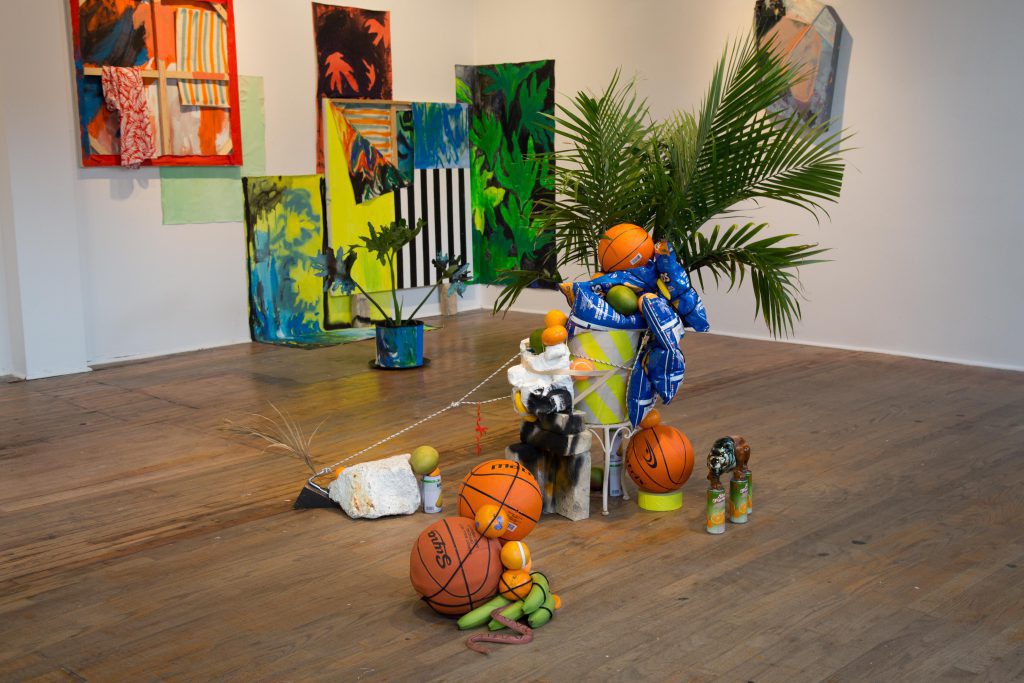
In Still Life in Complementary Colours (2016), Harrison explored the lush, post-impressionist world of Henri Rousseau that further challenged the balance between authenticity and imitation. This was acutely depicted through the carefully rendered palm fronds, juicy oranges, neon bananas, and exotic animals that were inspired by Rousseau’s 1908 work, Fight Between a Tiger and a Buffalo (2016), which seemed to have exploded into the gallery. The installation further punctured into real space with everyday objects of 21st century consumption flung against a live palm plant, while real oranges, mangoes and bananas slowly ripened next to bags of Doritos and a rubber snake. The basketballs showed their perfect, textured roundness and garish orange colour in juxtaposition to the real fruit, which paled in comparison. Finally, the iconic tiger made an appearance in the form of a ceramic figurine, perched confidently atop four cans of mango juice. In this contemporary sculptural mashup, the ostentatious colours of the replicas overwhelmed the real in a self-referential cycle.
The three pieces by Wallis Cheung, a Toronto-based artist and member of art collective VSVSVS, also contained painterly references while moving away from the confines of two dimensions. Cheung’s asymmetrical, gem-like fabrications inhabited the space between painting and sculpture–still mounted securely on the gallery wall, yet decidedly not flat. Cheung creates these works by marking up wood panels over time, trying out new colours and textures and embracing accidents, so much so that the wood panels are cut up and constructed into reliefs. Her work Talking Like a Waterfall (2015) was visible upon entering the gallery, whereas In a Little Stuck (2015) and Open Frame (2016) were placed on the other side of a dividing wall, anchoring the front and back of the exhibition space. I was enticed by Cheung’s work so much that I wanted to get close to further investigate the colours and patterns as well as the imperfections in the assembly, such as the painted over–but still visible–wood screws and edges that didn’t quite line up. From far away, Cheung’s work look like pastel rocks emerging from the gallery wall, while a closer inspection reveals the artist’s pleasure in process.
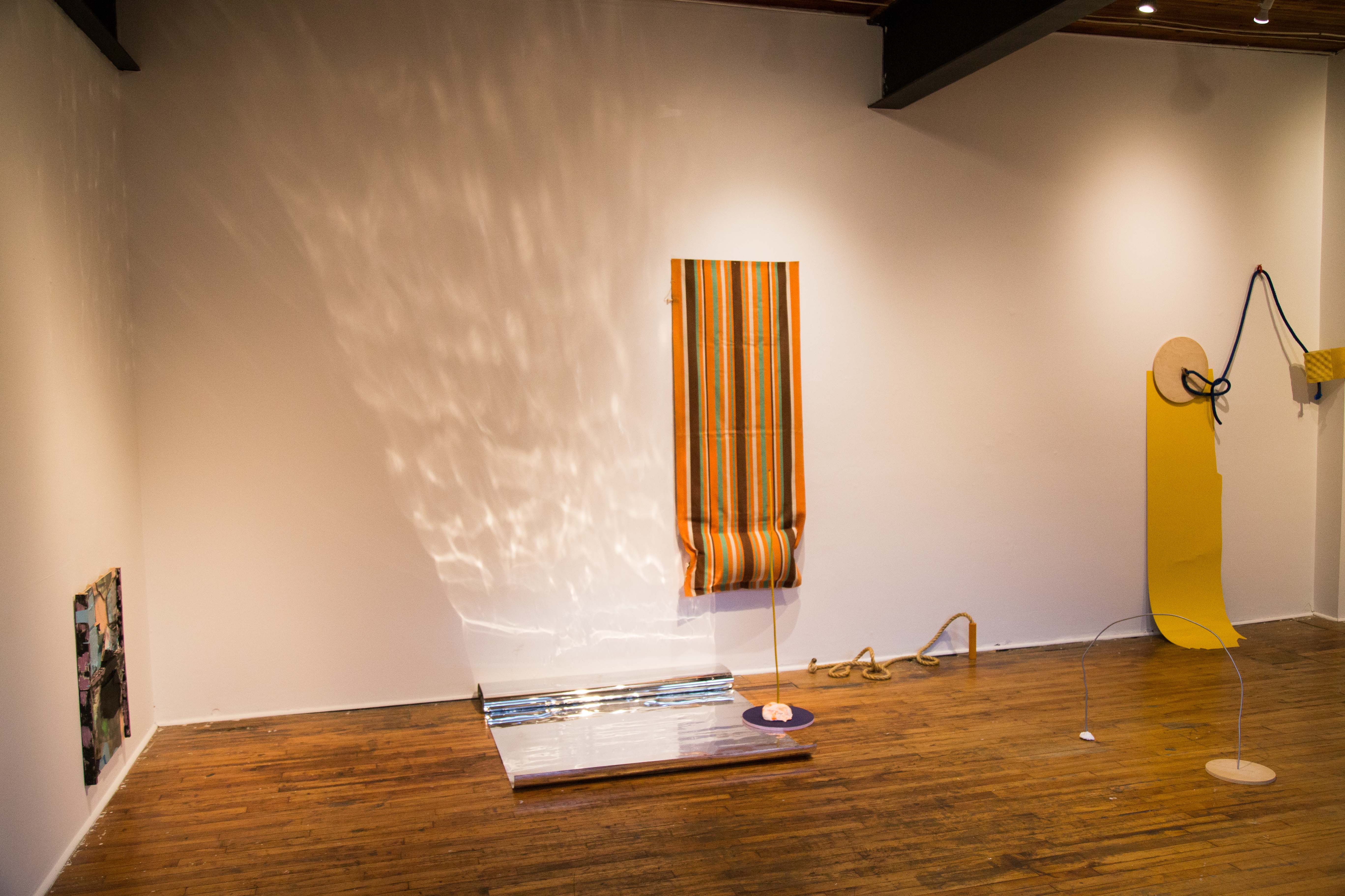
In her work, Michelle Foran uses found industrial objects and everyday materials as a way to find beauty in the banal. The flat expanses of 1970’s orange, brown, and green stripes on the lounge cover which was mounted to the wall next to a shimmering strip of mylar in her work, Swan Dive into the Mylar Wave Pool, recalls David Hockney’s 1967 painting A Bigger Splash. By combining two-dimensional explorations of flat colour with the dramatic splash of shimmering mylar–which delightfully cast itself onto the gallery wall–the work employed the unexpected to further justify its three-dimensionality. Her other works, A Loose Tie Means a Long Day and Strong Flea Jumps, recalled minimalism in their use of carefully considered industrial objects and spare use of colour in a playful titled arrangement. All three were placed in close proximity to one another, which gave the viewer a sense of walking into an oversized abstract painting filled with broad brushstrokes and playful textures.
Placed on plinths throughout the exhibition, Jennifer Wigmore’s work pushed most clearly into the realm of sculpture. Wigmore’s pieces embraced raw material, elevating mistints and slabs of dried acrylic to the status of sculptural abstraction. The artist’s approach seemed centred around being in dialogue with her materials, rather than just manipulating paint onto a two-dimensional ground. References to materiality were prominently displayed, and as was evident in the titles of her work–Paint Tongue, Paint Totem, and Paint Rope–all put paint at the forefront of her practice. In their placement throughout the gallery space, Wigmore’s paint-objects were able to be viewed in conversation with the other artists’ work. Paint Rope, which was situated in the front window of the gallery, caught the attention of passers-by, and the shiny acrylic surfaces of Paint Tongue complimented the plastic, primary-coloured pieces in Harrison’s installations.
The four artists’ work were thoughtfully organized in the large gallery, each given the necessary space to be viewed individually, while also situated in a way that allowed the work of one artist to flow into the next. The OCAD U Student Gallery is housed temporarily in a depression-era building perched tenuously amidst the experimental architecture of the black-and-white Sharp Centre for Design and the looming glass buildings of Toronto’s financial district. The warm smell of old wood floors combined with the continually ripening fruit in Harrison’s piece, worked to create a heady scent that was grounded by the myriad of colours and textures. The sun-flooded space became illuminated by the neon oranges and cobalt blues of Harrison’s Still Life and the deep teals and golden yellow of Foran’s installations. The commentary on painting was clearly articulated by each artist from different viewpoints: while Wigmore’s work celebrated the beauty in raw material and otherwise unwanted paint, Foran’s pieces eschewed paint as a material in favour of swaths of colour created by found objects. Cheung’s contributions were carefully constructed to inhabit a space between sculpture and painting, while showing the joy of mark-making and the accidental way that clashing colours and patterns can find harmony. Finally, Harrison’s installations brought the viewer into a densely packed artist’s studio, showing the mess of creativity and the strange relationship that art–particularly art that dapples in realism–has with the real. Together the artists have pulled references from over a century of painting history, bringing these references into a simultaneously minimalist and maximalist exploration of colour and texture. In four distinct, but highly connected practices, the artists have managed to comment on well-known conventions and materials in new ways, developing three dimensional works that are still comfortably grounded in painting.
All images taken by Qendrim Hoti.