

Wall Drawing #1 and Wall Drawing #2: A Conversation between Sean Weisgerber, Daniel Griffin Hunt and Rebecca Travis
29 April 2022
Sunday March 20, 2022, 1pm EST. Three individuals (Sean Weisgerber, the artist; Daniel Griffin Hunt, curator of The Size of a Credit Card at the plumb; and Rebecca Travis, Curator and Collections Manager at Open Studio) meet at Open Studio in downtown Toronto to look at and discuss Weisgerber’s solo exhibition at the gallery’s Feature Wall, aptly titled Wall Drawing #1. The trio sit around the work in folding chairs, one with a large book on his lap…
Sean Weisgerber: I like that Dan’s got an Art Theory 1900-2000 book on his knee. (Laughs)
Daniel Griffin Hunt: Yeah, well I was thinking I should do a bit of light reading before.
SW: Yeah, I was gonna say, looks…like a super afternoon delight.
(All laugh)
DGH: You should’ve seen me on the subway, I opened it up and was skimming through this book like it’s gospel.
SW: Trying to find some content?
DGH: I actually brought it because I didn’t want to misquote some Sol Lewitt. I thought that was something really pertinent to the way that these projects have shaped up in a lot of ways.
SW: I don’t think you can make a wall drawing without talking to Sol Lewitt…
Rebecca Travis: Have you always had an interest in him?
SW: Definitely. When I was doing my BFA in Vancouver, I remember reading “Paragraphs on Conceptual Art.”1 The idea that it was enough to just conceptualize the work and that you could have a less object-driven practice really blew my mind in terms of what art production could be. That’s also, in a way, a very “Vancouver” way of thinking about art-making. It was really generative and probably pushed my practice forward significantly. Something about it that I love too is that his work has this visual candy that draws people into the conceptual ideas. I think that’s something a lot of conceptual art at the time didn’t have and was a big problem for it getting into the world, because it was always really dry.
RT: Pretty insular and self-referential.
SW: Yeah. And I think maybe trying to rebel against Abstract Expressionism and those much more formal kinds of works. I do think that LA conceptualists like John Baldessari brought back more humour, more play, more colour, more formal elements, and that created work that people wanted to engage with both conceptually and visually. There’s a lot to look at out there…
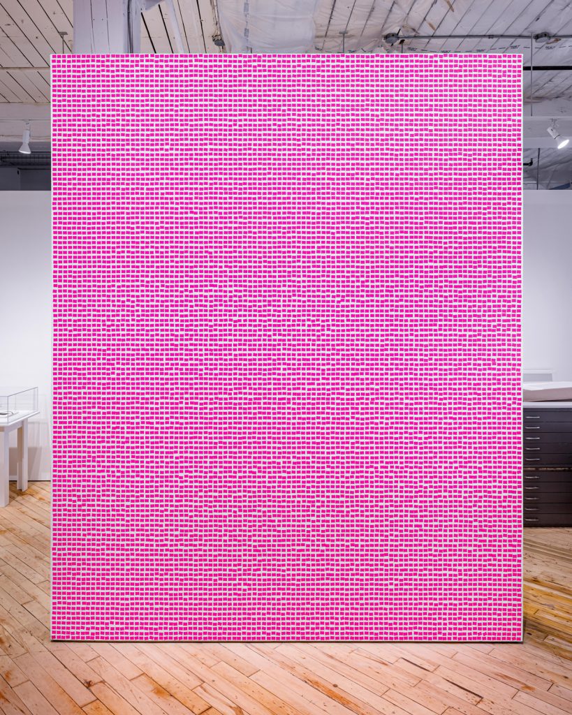
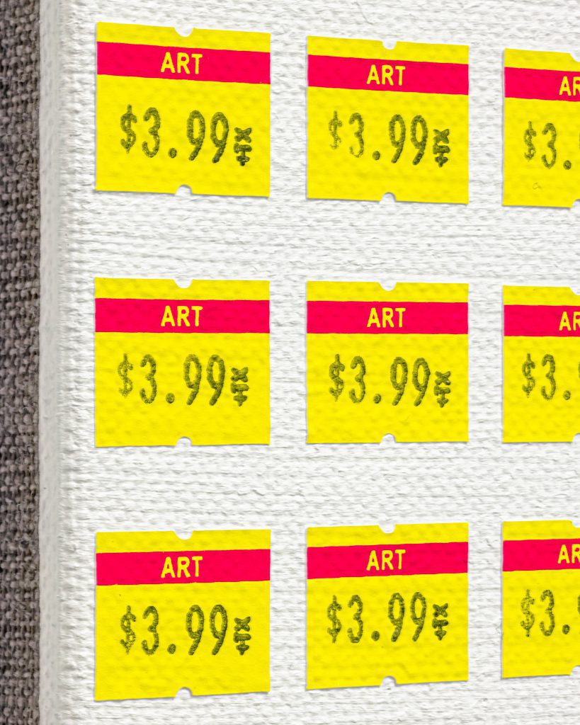
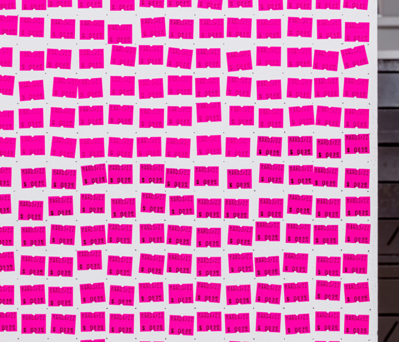
RT: People have been really responsive to this so far. Partly, it’s that real blast of colour that draws them in, and then the detail in each price label as well. There’s this macro view of it and then you get so much more from it up close. As you were saying, there’s that kind of treat for the eye that is sometimes missed with conceptual work.
SW: In terms of choosing the monochrome for the first few wall drawings, I think that history is really rich and dense already. I love using one single unit of colour, because it creates such a simple, pleasurable thing to walk up to, and then once you’re in front of it, you’re kind of forced in. It’s like you’re being confronted, and using the fluorescents was an additionally specific choice. As a viewer, you can’t ignore it.
RT: The light literally reflects onto people and bathes the whole surrounding space in this pink glow. I hadn’t thought about it having that kind of effect beyond the surface of the wall. When people are looking at it, they become a part of the work, as they take on this colour palette that’s forcing in on them.
DGH: There’s a pretty strong phenomenological implication to standing here in front of the work. To circle back to something you said earlier about this split between Sol Lewitt and the conceptualists of New York, and the emergence of John Baldessari and Nauman—I can’t help but think of the economics of those things. It’s always been expensive to live in New York, but at the time Baldessari was working in LA, it was cheap. Very affordable. Bruce Nauman was living in Pasadena. They could easily afford to live in these places, and with that were granted the luxury of space and time, which allows a flex for humour, something that wasn’t as apparent in New York at the same time. When you talk about that history and when we look at [Sean’s] work, it’s almost the result of the antithesis. You live in an expensive city under the proverbial conceptual umbrella of the Sol Lewitt’s and the John Baldessari’s. The work is playful, but at its core, it’s also about the economics of art, and for me, that’s a nice materially and historically significant tautological circle.
SW: That’s something that I definitely had to take into consideration when moving to Toronto. I was so cost-conscious because moving from Saskatchewan to here, it was almost double the price, so I was watching my finances more dramatically. It started making me think more about the costs embedded in everything. It made me think, How much labour do I need to supply to afford life? (be that as a working artist or shoring up that income with extra work) These wall drawings show what the cost of the labour is in that particular moment, and also in a way, the discrepancy of what you get compensated versus the cost of living.
RT: It’s interesting that these wall drawings stem from a body of work about paintings [Price per Square Inch series] as commercial objects. You’ve taken something about commercialisation, labour and ultimately about selling, and then at the same time, you’re flipping that into a work that—unless you do some kind of commission—really isn’t the most commercial material to work with. My first interaction with Sol Lewitt was at an exhibition2 that was about the paperwork behind conceptual artworks in order to allow them to sell. It was the contracts or authenticity certificates that were signed by the artist to validate sales. One of the things that I was drawn to when we talked about doing something at Open Studio, is that printmaking also has its own complicated relationship with the commercial market. The fact that this work is situated within a printmaking centre, but also within a shop space, speaks to so many different levels of that history.
SW: I’m really into the idea of the multiple in general. I think that’s something that comes from printmaking language. For the Price Per Square Inch (2017-ongoing) paintings, I used many printmaking techniques coupled with painting and sculpture techniques—a real plethora of different languages. At the end of the day, those works speak to painting, but they are also related to so many other different mediums as well. I wanted them to speak more directly to the value of a painting, whereas in the wall drawings, I think it’s more about the value of labour but also a more performative scenario.
DGH: I can’t help but think that when you describe the performativity of this, and also I’ve seen you use this object (the price gun), that in a lot of ways is like a variation of a printmaking tool. It has the components of a printing press, but it’s done in such a way that the art components have been rounded out for matters of efficiency. It’s not the intention of the tool that matters.
RT: Something we’re trying to push here is thinking about print more expansively. If you can think of the pricing gun as basically being a handheld printing tool, then it helps with that broadening of understanding. I hadn’t really anticipated that when you changed the rolls of stickers or started on a new day, that there would be this variation in tone. There are these idiosyncrasies and different sections based on when you’re stopping and starting, or when you’re reloading the pricing gun. It feels much more like drawing through those tonal shifts; it’s not uniform.
SW: I’ve been making the Price Per Square Inch paintings since 2017, but I’ve never had a price gun. I never bought any price stickers to model the paintings after either, which in retrospect is…weird. When I was stamping the paintings, I was just doing it very loosely, I wasn’t thinking too much about those discrepancies of some having more ink, some less, but I actually didn’t realize what a direct relationship to the real thing it had. Because I’m working on the wall drawings left to right and then down, you can really see the degradation of the ink roller. As I was working on it, I started to use that as a tool to bring the viewer into a certain place—changing the ink roller when I switched the price or the day. For the one at the plumb, I’ve started using one ink roller per day and letting them run down.
RT: You’re learning to use it…
SW: Totally! If it was a different operator, they’d probably have another strategy and I thought about encompassing that into the instructional panel next to it. But I actually like that it becomes a decision that the operator has to make. I don’t really want to control that element. In terms of placing the stickers, there’s a kind of looseness versus the paintings, which I kept very tight. The paintings informed the drawings, but now I’m curious to see how these are going to affect the next series of paintings. Letting them wander and be more meandering creates a much more reasonable object to look at. It actually kind of calms the eye.
RT: There is definitely a moiré effect that you get when you look at it for a while.
SW: Yeah, you could probably testify to that, sorry.
(All laugh)
RT: The other thing that is interesting with this, and I get more of a sense of it because of those changes in ink pressure and the placement of each individual piece, is that you can think of it as one complete work or as 11,500 miniature, autonomous entities that are all coming together.
SW: 100%
RT: And they do all have individuality to them, much more than I’d anticipated when we talked about doing this project.
DGH: I agree. I can’t help but separate this from a digital image and pixelation. I’ve spent more time with Wall Drawing #2 (2022) at the plumb, and it’s almost like looking at muscle tissue on a digital screen: if you had blown up the image and it became pixelated. There’s an organicness to it, but when you look at it from far away it also has a standardization.
SW: There is a really organic, almost textile weaving-like texture to the work in that way. This gives your eye a chance to breathe for a second and find a spot to take in.
DGH: I can’t help but see patterns of your breathing in the slight ebbs and flows of each row. It feels like I can almost track the physical fatigue that is happening when you’re making them.
RT: The white negative space actually holds its own too. The pink stickers are so overwhelming that I find I’m often looking for pathways between them. I’m curious to see the wall drawing at the plumb, because we were talking about how, as a free-standing wall, it has this sculptural quality to it.
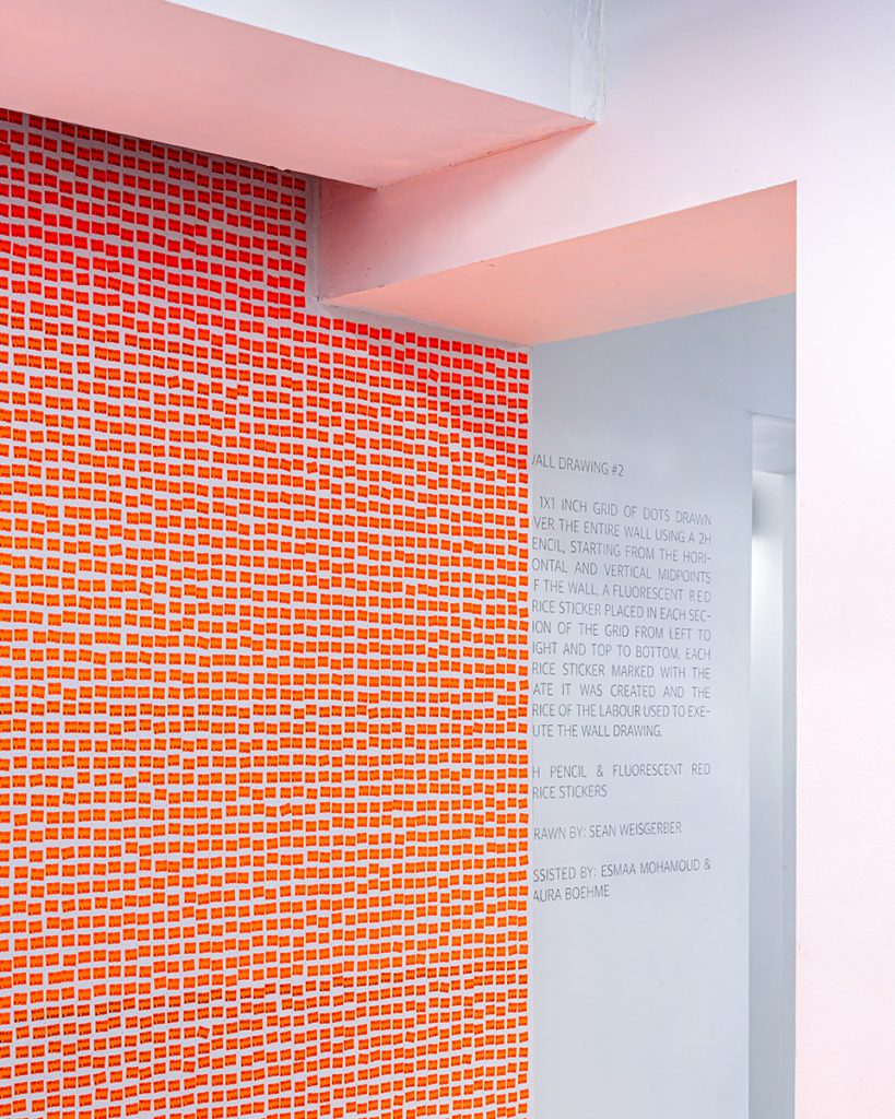
SW: I agree with that observation because Wall Drawing #1 (2022) has pretty much the exact same instructions as Wall Drawing #2 (2022). But, the reason that I didn’t want to be too playful yet in terms of changing things, is because I thought this [Wall Drawing #1] is so monolithic and actually feels a bit like a painting or a sculpture in that way, but there’s a lot more infrastructure in the context of the plumb, there’s ducts, there’s plugs, there’s things to work around. I thought it would be interesting just to shift one thing and see what the architecture does to the work, and the monochrome operates as a useful tool to do that.
RT: I think it also draws attention to the little changes like the dates or the price evolving as you go through it.
DGH: Very satisfying realizations that happen throughout.
RT: That’s the other thing to me that really marks it outside of the paintings, is that stamping of the date, it has that durational quality.
SW: To that point, I would say that On Kawara has been a significant influence. His postcards, telegrams, and the date paintings in particular. I’ve always thought that his project as a whole was amazing, especially how it concretized time. I often think about the performative element of making those paintings over the span of a day and how they act as a reflection on that day, because as a viewer, you’re thinking about what was he doing, or what was he seeing that day.
DGH: And the newspapering too.
SW: Yeah. The newspaper speaks to what happened that day, and the more time that elapses, it becomes even more interesting. My series of wall drawings engage in how time is recorded too, also in a bit of a performative way, evidencing how much I worked in a day, similar to a time card. Some days more, some less. I don’t know how many thousand stamps on average a day, maybe 3 or 4, and I think that this was around 11,500 total.
RT: I was surprised at the amount of time it took to plot out the square inch framework. To me, that really is as much a part of the work as the actual price stickers, because it took two solid days of the install—almost half the time. It became much more of a foundational component than I was expecting.
DGH: A very similar experience was had plumb-side with that. It does feel a lot like an early banking system. You set up this infrastructure and then you’re simply filling up the ledger. I find it’s this thing that you look at and think, wow, there’s a lot of labour, and then there’s a lot of pink, and then you’re like, hang on, they’re changing—you can go through a emotional and cerebral gamut of feelings before you get to the end and you walk away thinking… Sean, you cheeky motherfucker.
(All laugh)
DGH: It’s really smart, full cycle.
RT: Yeah, it works on multiple levels. There’s the familiarity of these particular price stickers too. They remind me of going to the local shop as a kid and there’s a nice connection there that’s outside of mass commercialisation. It’s almost like a nostalgia hit.
DGH: That makes me think that it has something to do with a specific level of economy. It’s not Walmart, it’s a family-owned business that has more of a one-to-one relationship, which feels very apt.
SW: When I was growing up in Saskatchewan we’d go to these little hardware stores or independently run convenience stores and they’d have these kinds of stickers. I was always really attracted to them. This project really isn’t about a nostalgic sensibility for me, but I think that through the process of doing it, there’s something I really connect to. Particularly with this shape, this rectangle one with the little circle cut out, specifically. Apparently ‘Towa’3 is the style and I just love that the little half circle is registering the labels in the device. I never understood just looking at it, what the purpose was.
RT: That’s another nice connection with print language too. I was thinking maybe this is a good time to wrap up the Open Studio conversation and move on to the plumb, unless there’s anything else?
SW: I still always have tons of things to say…
(All Laugh)
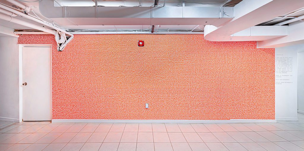
Sunday March 20, 2022, 2:30pm EST. Sean, Daniel and Rebecca have since left the exhibition at Open Studio and driven from the 401 Richmond building to Dufferin and St. Clair Avenue West, where the basement gallery space the plumb is currently hosting the group exhibition curated by Daniel called, The Size of a Credit Card…
RT: We were just saying how much more enveloping it is when it’s a horizontal rather than a vertical composition. Especially because it meets you right as you walk down the stairs.
SW: I think it’s because it goes floor to ceiling, and takes over the whole space, it has to work within the infrastructure. It’s surprisingly different [in relation to the Open Studio installation] and it’s funny because it is about double the size, but it doesn’t really feel that much bigger in a way.
RT: It’s like looking at a big horizontal painting rather than looking at a big vertical painting.
SW: Totally.
RT: They make you feel very different and they involve you walking up to them in different ways to fully experience them.
SW: Definitely. I remember seeing a Kenneth Noland stripe painting [Wild Indigo (1967)4] before the pandemic. We went down to the Albright Knox and they have a gigantic stripe painting in their collection. It was probably 16 to 17 feet wide, by 7 or 8 feet high. I’d never seen one in person and I couldn’t believe how much it engaged my peripheral vision. It had a really visceral effect on the body because you really can’t take it all in. That’s definitely something I’ve been thinking about when making this piece. I keep thinking what it would be like to do an installation where it took over an entire room and was no longer about the two dimensional surface. To get back to Sol Lewit and his wall drawings, I can’t think of that many of them that actually go off the wall. There are a few, but not many.
RT: Do you know the artist Jim Lambie?
RT & SW: (Together) The floor works!?5
RT: So they are doing something in a similar way. The floors become almost liquid moving around the space, often completely embodying the architecture.
SW: Especially with their psychedelic colour scheme…
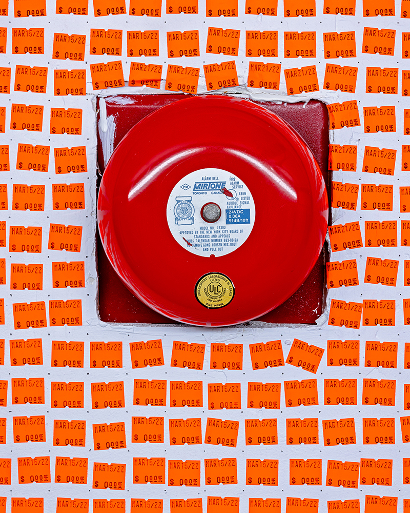
RT: [Pointing to Wall Drawing #2] which this could certainly lend itself to as well. Is this orange or red?
SW: It’s called fluorescent red, but they tend to feel more orange.
DGH: For me, the red fire alarm is resetting the colour structures in my brain when it’s up against this work. When we were at Open Studio earlier talking about the waves of looking through the white and the orange, and now I look at this work here at the plumb, I can feel the cones and rods in my eyes being depleted. It’s very exhausting to look at. When Disney was developing EPCOT in their Florida Disneyland location, they made all the architecture a red hue because it made your eyes more susceptible to green, which meant that the grounds crew didn’t have to maintain the grass as much. The grass just looked greener.6 So, when I look at something like this, I can’t help but try and find the other colours—do you know what I mean?It’s the reciprocal colours that make the orange feel like it’s depleting in my eyes.
SW: Right.
DGH: Kind of fascinating…
SW: Well with this one even [pointing to Wall Drawing #2], the colour of the wall is white, but in relation to these stickers, it reads as a purpley blue-grey. I remember something similar happening with the Price Per Square Inch paintings. They all had the same white backgrounds, but they were doing some very similarly optical, colour relation things. Each one changes the perception of the white ground differently. There’s something interesting about fluorescent colours in that you can only take so much of it before it starts to extinguish in your mind’s eye.
RT: It’s just so unnatural.
SW: Yes!
RT: They are not really of this world, they are fully just human-made.
SW: Exactly!
DGH: It makes me think of Sterling Ruby’s fluorescent orange monolith, SPECTER, that was at Desert X in 2019. It was a big fluorescent box in the middle of the desert. It was interesting because it did actually ‘burn out’. Something about the way the fluorescent is produced can’t handle too much UV light.
SW: Fluorescents will fade, inevitably, especially if they are in the sun. I always think about these things in relation to the paintings, and those fluorescent [Price Per Square Inch] works. I kind of like the idea that they will burn out. I’m sure collectors won’t, but I like the milky, desaturated colour that starts to happen over time as they degrade. It’s akin to Warhol’s flower paintings, some were originally neon in palette but now some have lost that punch, depending on how and where they were kept.
DGH: Right.
SW: The more exposed they were to the world, the more they have faded. I like the idea that these objects aren’t necessarily static.
DGH: Especially when the nature of them has a kind of one-to-one responsiveness or material providence. These stickers are items you see in a family-run business. The content delivered on the stickers is responsive in nature, so it feels fitting to me that the material itself is responsive to its environment over time.
SW: 100%
RT: It’s definitely interesting seeing it within the weird architectural, functional elements of a basement space. There’s no getting away from that, they are just part of it.
SW: That’s part of it, but it’s also been an interesting challenge to work through. Trying to figure out how close to install to certain edges or fixtures on the wall, or how to deal with certain spaces that aren’t exactly one inch. My decision was to leave some elements out, to better highlight the architecture of the site, not unlike Sol Lewitt’s blue chalk line wall drawing [Wall Drawings #51 (1970)7].
RT: The associations people feel with the placement of the works will change, obviously, based on whatever they bring to it. Also, we’ve been talking about affordability and artists trying to find spaces to present work, to create work, to put out new ideas, and we are here in this basement space, which from the outside is just a purple door.
SW: Totally.
DGH: Yeah.
RT: I think that because you’re drawing so much attention to the wall’s surface and the place it inhabits, it does kind of bleed into the wider context of what the plumb is, and in that case, where do a collective of artists find spaces now?
SW: To that point, there’s something about doing the wall drawings versus working in the studio. When you’re working on a rectangle and a kind of perfect surface, it’s just so pristine. You have full control, but I actually like these drawings and how they kind of force you to react to the space…
RT: Yeah, they can become more unruly depending on the space they are in.
SW: And probably, tragically in a way, most spaces that I’ll end up having the opportunity to do this in, will be much more structured and controlled [laughter], but this has been such a great opportunity to do both of these at Open Studio and the plumb because they are literally polar opposites in terms of architecture.
RT: The nice thing too if you keep the date and the price as the one constant across these works, even if the contexts change, is that you’ll see shifts across currency and other economic variables.
SW: I have been thinking about this in speaking to you [Rebecca] because they have a different variety of price sticker in the UK. It doesn’t really exist in North America. It’s a rectangle with two half circles on each side. I’m sort of saving this shape, because I’d like to do the series marked with pounds or other currencies.
DGH: I’ve been thinking a lot about the economies of a credit card and what that looks like. Not as a pros or cons notion, but as a relationship to capital as a complicated fact of the transactions of late-stage capitalism.
SW: I find that transactional relationship very interesting. It’s very much related to a sort of MSRP (manufacturer’s suggested retail price). With the paintings, I’m producing an object for a collector, in a way, but with the wall drawings it could be seen as more for a member of the general public. One thing that was totally unanticipated in terms of those relationships was getting people to assist with the creation of the work.
[Turns to Rebecca]
It’s funny, spending time with you and Brad [Issacs], as we laid out the framework for Wall Drawing #1 (2022) [at Open Studio] and drew the grid of dots over the entire wall over a couple days, we got to know each other really well. I felt like we were long time friends by the end, and I felt that here [at the plumb] too with Esmaa [Mohamoud] and Laura [Boehme], as they helped create the grid of pencil dots too. I thought that was pretty interesting as an unanticipated consequence. Even thinking back to Sol Lewitt, I always loved looking at who made the work and who helped in the production.8 I love that transparency.
DGH: A term I have been thinking about a lot is subscendence—as the opposite of transcendence, essentially the concept that wholes are greater than the sum of their parts. The example Timothy Morton uses is a passport as a subsendent object. It is a representation of you as one person, but also indirectly of your politics and the history of the places you live, and the transactions these places have with other places. I think you can think about credit cards like that.
RT: It’s interesting thinking about the credit card as an object. It feels kind of alien, especially after the last two years, to interact with someone and hand them cash. When you pay with a credit card, especially with tapping, it’s a very brief, insular thing to do. I think the price stickers here speak to a time or context where you would have a slower, much more involved interaction.
SW: There’s trust in that transaction too.
DGH: Trust with credit cards is an interesting concept. Widely available, commercialized security products are at their core very vulnerable objects. It’s the idea that a lock can be picked because it has to be made in a way that is economical to its production. You can see a similar concept happening when you buy a price gun for example. There’s an interesting inversion there, since the object has to be cheap enough that you don’t have to add that much additional cost to the distribution of the goods. The nature of that cheapness compromises the authorship or authority of the security, or trust, of the crux of the object.
RT: [To DGH] How does this piece sit within the context of the other work within the show?
DGH: We are kind of dancing around the tabooness of money, especially when it comes to art, or to class and the relationships we have to those things. As the piece that kind of breaks the two rooms up, the zero signifier becomes an interesting moment that illuminates how the show is working, because zero is a neutral number. It’s neither in the red or the green. It’s in the black.
SW: I think that was part of the reason I decided on the fluorescent red stickers for this iteration; a bit of a nod to the fact I was actually going ‘in the red.’
RT: I feel like we’re sitting in front of a sunset, just basking in the glow.
(Laughter)
SW: That’s great, looking at this piece this long really scrambles your brain. It’s such an unruly thing.
RT: Isn’t that a thing about red too? That it’s the only colour to have a proven psychological effect on people. You root for the team in the red jersey?9
SW: Also with art objects, they…
DGH: Sell the highest
SW: Sell for more, yeah.
RT: I remember learning that Barnet Newman’s painting, Who’s Afraid of Red, Yellow and Blue III (1967), is one of the most destroyed paintings in the world—partly because it was so large and minimal, but also because of the intense red colour.10
DGH: I think the Newman painting and Sean’s Wall Drawing #2 (2022) both don’t hold the conventional relationship that an object would normally have. It creates a small pseudo environment physcologically. We could scoff at it when I say it’s scary, but I think if you’re not familiar with it, it is scary.
RT: Yeah, it’s a weird thing to confront.
SW: It seems you almost would go into this violent rage or this kind of sublime notion of otherworldliness and transcendence. It’s interesting how polemic these reactions are.
DGH: Fight or flight…
SW: It reminds me of the stories you hear about people fainting or crying in front of these large abstract expressionist paintings. I, of course, want that for this piece, but I doubt it will happen.
(All laugh)
RT: Only time will tell.
Notes:
- https://mma.pages.tufts.edu/fah188/sol_lewitt/paragraphs%20on%20conceptual%20art.htm
- https://saltonline.org/en/359/in-deed-certificates-of-authenticity-in-art
- https://www.pricegun.com/price-labels/towa-labels/
- https://www.albrightknox.org/artworks/19725-wild-indigo
- https://www.tate.org.uk/art/artworks/lambie-zobop-t12236
- https://sites.google.com/site/theoriginalepcot/project-vs-reality/1982-epcot-center. (The pavement at Epcot was engineered by Disney and Kodak photography to be painted a specific custom colour of pink that makes the grass look greener and pictures look brighter. In addition, the coloured sidewalks give an overall cleaner look to the park.)
- https://massmoca.org/event/walldrawing51/
- On the certificate of authenticity for each wall drawing, Lewitt always uses the format of “First Drawn by: and First Installation,” referring to who created it and where it was realized first. Here are some examples from the Albright Knox collection and if you go to his main gallery; and Paula Cooper Gallery lists that information as a part of the image credit: https://www.paulacoopergallery.com/artists/sol-lewitt#tab:slideshow;slide:8,
- Albright Knox owns Wall Drawing #24. They have an image of the certificate, which notes that it was first drawn by Adrian Piper at Dwan Gallery in 1969: https://www.albrightknox.org/artworks/20151421a-e-wall-drawing-24
- Wall Drawing #17. They have an image of the certificate, which notes that it was first drawn by Steven Gwon, C. Hansen, T. Julia, Al William and Sol Lewitt at Dwan Gallery in 1969: https://www.albrightknox.org/artworks/20085335a-d-wall-drawing-17
- https://99percentinvisible.org/episode/the-secret-lives-of-color/
- https://99percentinvisible.org/episode/the-many-deaths-of-a-painting/
Wall Drawing #1 by Sean Weisgerber ran from March 4 – April 16, 2022 on the Feature Wall at Open Studio Contemporary Printmaking Centre in Toronto, ON. Wall Drawing #2 (2022) by Weisgerber are also featured in the group exhibition, The Size of a Credit Card, which runs from April 1 – 29, 2022 at the plumb in Toronto, ON.